We build brands that speak before you do.


Designing Harmony: The Calm Between Commerce and Care

-
VH began as a wellness studio specializing in acupuncture and Eastern-medicine therapies. As their product line grew, they faced a core identity challenge: how to merge a serene, service-based spa experience with a modern e-commerce presence. Customers who visited the spa didn’t realize products were available online — and online customers were unaware of the physical experience behind the brand. The result was a fragmented identity that didn’t fully communicate their philosophy of holistic healing and modern accessibility.
-
Brandz Studio developed a unified brand ecosystem that seamlessly bridged spa and digital retail. We redesigned their website to create an intuitive dual-path experience — one that allowed users to effortlessly explore either in-person treatments or curated products, with storytelling woven throughout both.
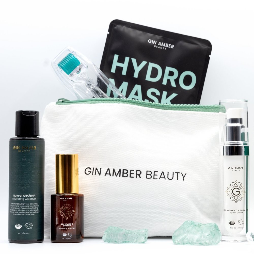
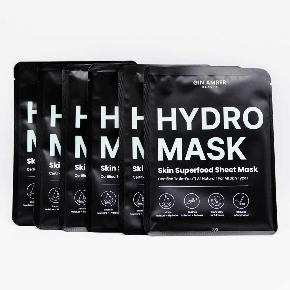
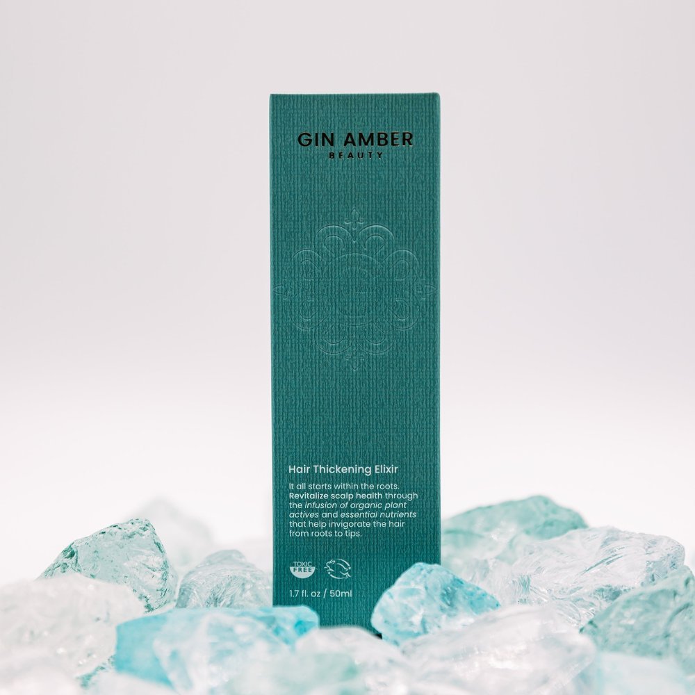
We expanded the brand through end-to-end packaging design, sourcing natural materials and collaborating directly with manufacturers to ensure tactile, sustainable packaging that felt luxurious yet grounded. The design direction focused on bringing Eastern medicine into the home — clean, minimal, and energetically calm, with organic textures and intentional detailing that echoed the spa’s sensory environment.
To amplify awareness, we spearheaded PR initiatives that positioned VH as a modern wellness brand, securing placement with Anthropologie, ASOS, Forbes and other major retailers. We also produced large-scale events in partnership with Goop, KindBody, and a New York–based jewelry designer — co-creating bespoke “ear-seed” collaborations that merged aesthetics with wellness innovation.
-
Brand Identity Refresh — refined logo, color system, and visual language to balance heritage and modernity.
Website Design & Development — seamless dual navigation for spa and product audiences.
Packaging Design & Production — sourced, designed, and developed packaging across multiple product lines.
PR & Retail Partnerships — secured national press and retailer placement.
Event Design & Collaborations — experiential activations in LA & NYC, plus partner-branded product lines.
-
The rebrand transformed VH into a cohesive wellness ecosystem — one that connects physical experiences with digital discovery. The new identity elevated their positioning from boutique spa to nationally recognized holistic lifestyle brand, blending modern aesthetics with ancient wisdom and creating a consistent customer journey across every touchpoint.
Color, Culture, and Cannabis: A Modern Event Identity
-
Cannabis Expo was expanding across multiple U.S. cities but lacked a cohesive, elevated brand presence. Their existing materials felt generic and inconsistent, failing to reflect the vibrant, forward-thinking culture of the industry. They needed a flexible visual system that could scale across cities while maintaining a recognizable identity — something that felt premium, playful, and unmistakably Cannabis Expo.
-
Brandz Studio developed a modular design system that merged bold creativity with structured cohesion. The foundation was built on a color-driven identity, where each city featured its own unique palette — ensuring distinction while preserving unity across the brand.
We introduced pattern work inspired by cannabis culture reimagined through modern design, using abstract motifs and energetic gradients to evoke curiosity and sophistication rather than cliché symbolism. Every touchpoint — from digital to physical — carried this unified rhythm, creating an instantly recognizable experience wherever the Expo appeared.
-
Large-Scale Event Displays & Wayfinding — immersive installations and directional signage designed for visual impact and spatial flow.
Stationery & Collateral Systems — cohesive printed materials for staff, partners, and attendees.
Direct Mail Campaigns & Invitations — tactile experiences that extended the event’s energy beyond the venue.
Social Media Design — scalable post templates, campaign graphics, and branded motion assets.
Email Marketing & Digital Ads — vibrant, conversion-driven creative that mirrored the event’s visual language.
-
The new identity transformed Cannabis Expo from a standard trade event into a curated experience — one that commanded attention, unified its multi-city presence, and redefined what cannabis-related design could look like.

Designing Transformation: Rewriting the Rules of Self-Development Design
-
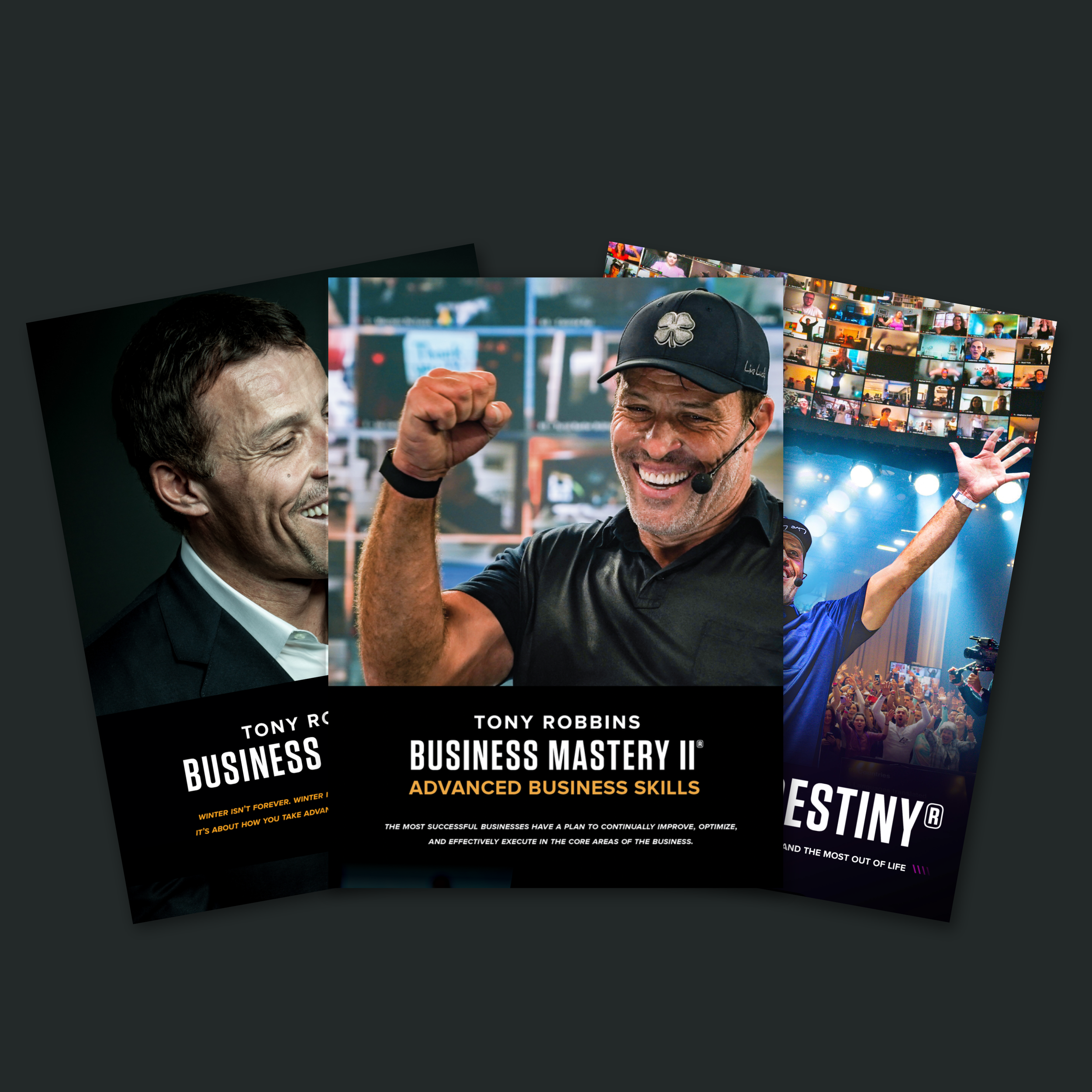
Tony Robbins’ global programs empower millions — yet the printed and digital manuals that supported these life-changing events had fallen behind. The visuals, typography, and copy style felt dated and disconnected from the energy of the modern Tony Robbins experience. Participants often viewed the manuals as disposable workbooks rather than inspirational keepsakes. The goal was to reimagine the entire ecosystem of learning materials to reflect the momentum, clarity, and transformation that define the brand.
The Solution
-
Brandz Studio led a full creative overhaul, designing a unified system of manuals and program materials that brought modern design and emotional resonance into every detail. We introduced refined typography, bold graphic structure, and language that spoke directly to the participant’s mindset—turning the manual from an instructional tool into a guided experience.
Each manual was intentionally crafted as a step-by-step journey, blending structure with inspiration. We incorporated interactive design elements—such as detachable quote pages and poster-style inserts—so participants could tear out, keep, or display their favorite insights. The result: a multi-sensory learning toolkit that motivates both during and long after the event.
-
Comprehensive Manual Redesign across a full year’s program calendar.
Visual Rebrand with updated color palette, typography, and layout systems.
Interactive Print Components designed for engagement and longevity.
Copy Revitalization aligning tone with Tony Robbins’ contemporary voice.
Production Coordination for consistent output across global events.
-
The reimagined materials elevated the entire Tony Robbins experience—transforming passive note-taking into active engagement and personal reflection. What once felt like coursework now feels like a collectible: motivational, design-forward, and purpose-driven. The new visual system set a new standard for how self-development brands can connect design, psychology, and human experience.
A brand isn’t made of colors or fonts — it’s made of meaning. It’s how a story travels, how a stranger turns into a customer, how design becomes destiny.
-
From logos to color systems and typography, we craft a visual language that feels timeless, cohesive, and unmistakably you.
-
Custom-designed websites that blend aesthetic excellence with seamless functionality — built to convert and connect.
-
High-level visual storytelling and campaign art direction for brands that need a signature look across every touchpoint.
-
Design that amplifies — from pitch decks and presentations to packaging, signage, media ads, and social assets that make a statement.
-
Strategic visuals and templates that keep your brand consistent, relevant, and scroll-stopping across every platform.
-
Large-scale moments brought to life through branded installations, signage, and immersive design experiences.
-
Ongoing creative partnership to guide your brand’s evolution with consistency, clarity, and a strong visual foundation.
Have Questions?
Let’s talk through your goals, your vision, and how we can support your brand’s next stage.
TRUSTED BY FOUNDERS AND VISIONARIES
TRUSTED BY FOUNDERS AND VISIONARIES
“Working with Madeline at Brandz. by Madzsies Studios has been an absolute joy. Not only is she beyond creative with her 'outside the box' ideas, she is also such a hard worker. Her ability to take on anything thrown at her and turn it around timely and exceptional is awe-inspiring. She will be an asset to anyone she works with.”
“Brandz. by Madzsies Studios was an absolute joy to work with. Madeline exudes professionalism, became a seamless and interactive face of the brand and any professional contacts alike.
“Working with Madeline at Brandz. by Madzsies Studios has been an absolute joy. Not only is she beyond creative with her 'outside the box' ideas, she is also such a hard worker. Her ability to take on anything thrown at her and turn it around timely and exceptional is awe-inspiring. She will be an asset to anyone she works with.”
“Madeline is the kind of creative every brand dreams of finding. She listens, adapts, and consistently delivers above expectations. Her strategic thinking and artistic intuition made our entire rebrand feel cohesive, fresh, and full of purpose. I can’t recommend her enough.”